Chapter 10: Reading the Economy — On-Chain Analytics
Every trade, every holder, every whale — visible to anyone who knows where to look
1Reading the Economy — On-Chain Analytics
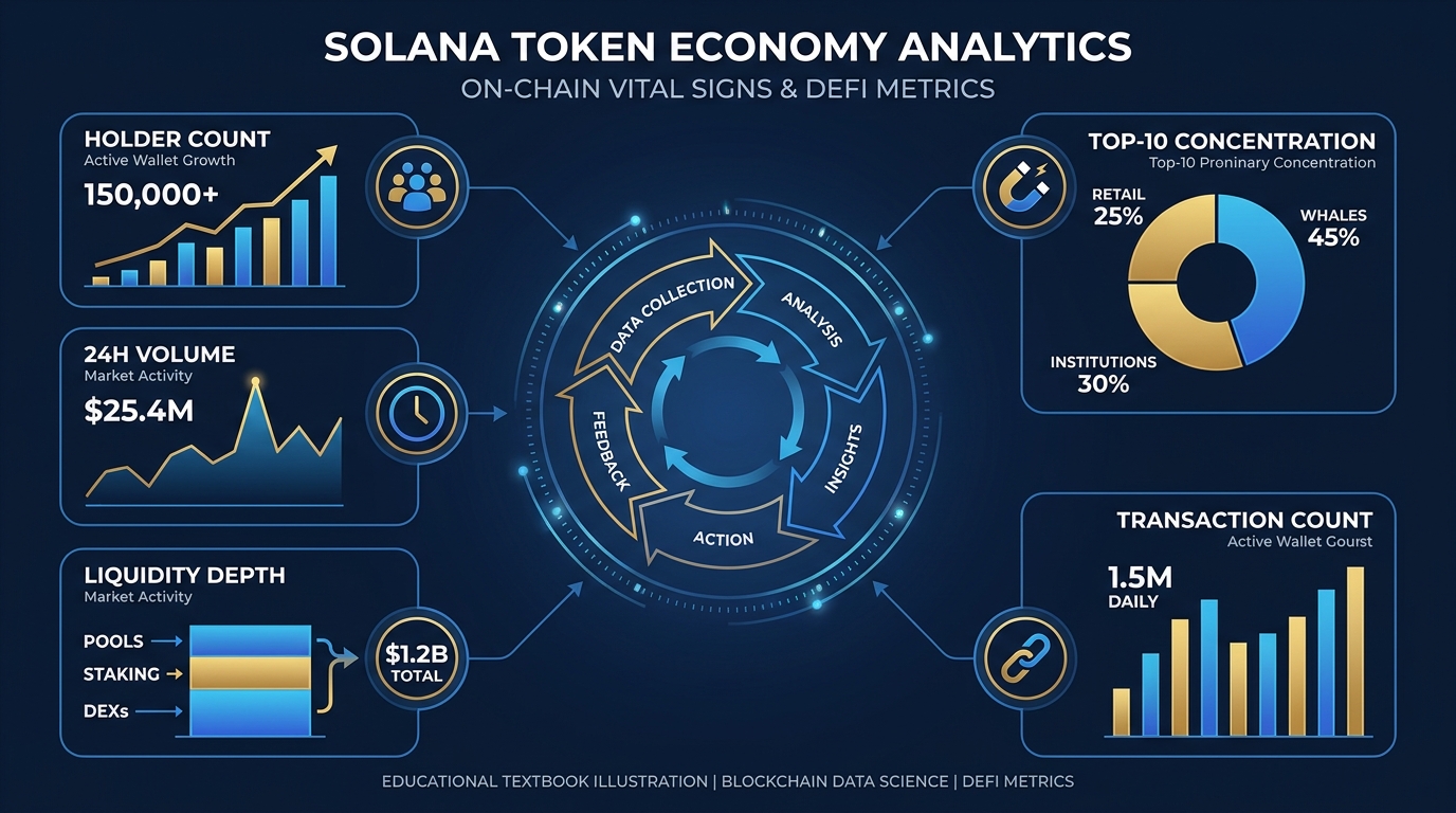
Figure 1:Chapter 10 Illustrated Explainer: The complete on-chain analytics stack — from raw blockchain data to actionable business intelligence. A token creator who cannot read these metrics is flying blind in a glass airplane.
Public companies issue quarterly earnings reports. They hire investor relations teams to curate what the world sees. They manage the narrative. Token economies have no such luxury — and no such shield. Every trade, every holder address, every whale movement, every liquidity addition or removal is written to a public ledger the moment it happens, permanently, readable by anyone with an internet connection.
This is the first economy in human history with no hidden books.
For a token creator, this transparency is simultaneously your greatest asset and your most demanding accountability partner. When your economy is healthy — growing holders, genuine volume, distributed ownership — the data tells that story better than any press release. When it is sick — concentrated ownership, falling liquidity, wash-traded volume — the data tells that story too, whether you want it told or not.
The question is never whether the data exists. It always does. The question is whether you are reading it before your holders, your critics, or your competitors do.
This chapter teaches you to read your token economy the way a physician reads a patient’s chart: not as a collection of numbers, but as a coherent story about systemic health.
1.1The Vital Signs of a Token Economy
In medicine, vital signs are the minimum set of measurements that tell a clinician whether a patient is stable or in crisis. Pulse, blood pressure, temperature, respiratory rate — four numbers that stand proxy for enormous systemic complexity. A doctor who walks in without checking vitals is not practicing medicine; they’re guessing.
Token economics has its own vital signs. They are not arbitrary — each one measures a specific dimension of your economy’s health, and each one can deteriorate silently while surface metrics look fine. A token creator who monitors all five is practicing token medicine. One who ignores them is guessing.
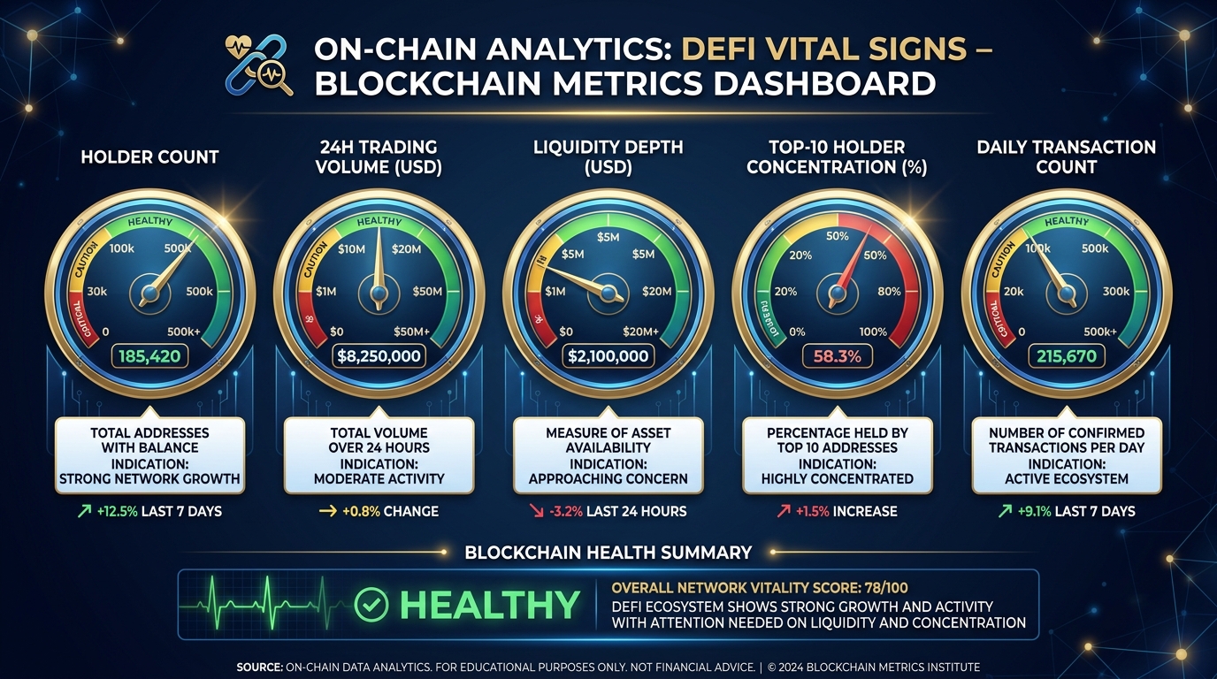
Figure 2:The Five Vital Signs. Like a medical dashboard, these five metrics together tell the story no single metric can tell alone. Watch all five, simultaneously.
1.1.1Holder Count
Holder count is your user base metric. It tells you how many unique wallet addresses currently hold a non-zero balance of your token. Think of it the way a SaaS company thinks about Monthly Active Users — it is the population of people who have, at some level, opted into your economy.
But holder count alone is a vanity metric. Ten thousand holders sounds impressive until you discover that nine thousand of them received a free airdrop, never interacted with your token again, and would sell instantly if the price moved. The number you care about is qualified holder count — wallets that have held for more than 30 days, wallets that have made multiple transactions, wallets that have participated in governance or utility features.
Holder count growth rate matters more than the absolute number. A token growing from 500 to 600 holders in a week (20% growth) tells a healthier story than one sitting at 10,000 with zero change for a month.
Where to read it: Solscan → Token page → Holders tab. Updates within seconds of each on-chain transaction.
1.1.224-Hour Volume
Volume measures economic activity. It is the total value of your token that changed hands in the last 24 hours across all exchanges and liquidity pools. Think of it as your economy’s heartbeat — the rhythm of trade.
Volume is the metric most easily manipulated and most frequently misread. High volume is not automatically good. Before celebrating a volume spike, ask three questions: (1) Is this organic or is it wash trading? (2) Did volume increase because of genuine demand or because price crashed and everyone sold? (3) Is this volume sustainable or is it a single event?
Healthy volume has a characteristic shape: it rises gradually, spikes modestly around news or utility events, and returns to a growing baseline. Unhealthy volume is either a flatline (no interest) or a series of enormous spikes with no underlying trend (wash trading or single-event dumps).
Where to read it: DexScreener → Token page. Volume shown by pool, aggregated across all DEXes.
1.1.3Liquidity Depth
Liquidity depth is the least glamorous vital sign and the most important. It measures how much buying or selling a market can absorb before the price moves significantly.
Here is the intuition: imagine your token’s liquidity pool has $10,000 in it. A single trade of $1,000 — just 10% of the pool — will move the price noticeably. Your token is thin. Now imagine $500,000 in liquidity. A $1,000 trade is 0.2% of the pool — essentially invisible. Your token is deep.
Thin liquidity is the structural vulnerability that bad actors exploit. When a whale sells into thin liquidity, price craters. When that crater triggers stop-losses or panic selling, more sell pressure arrives. A token with $50,000 in liquidity can be “broken” by a single $5,000 sell. A token with $500,000 in liquidity takes coordinated, sustained selling to meaningfully move.
Liquidity depth is the difference between a price that breathes normally and one that convulses on every medium-sized transaction.
For the chain-wide version of this number see DeFiLlama (Chapter 5, The DeFi Map).
Where to read it: Birdeye → Liquidity tab. Shows depth by pool and total locked value.
1.1.4Top-10 Holder Concentration
Concentration measures how distributed your economy actually is. Specifically: what percentage of your total supply is held by the top 10 wallets? This single number predicts more about your token’s future than almost any other metric.
A healthy, distributed token economy typically has top-10 concentration below 30-40%. This means no small group can unilaterally crash the market by selling. Projects launching from fair conditions often start above this threshold and work to achieve distribution over time through sustained trading, airdrops, and ecosystem growth.
Above 50% concentration, you are operating a token that is structurally vulnerable to coordinated dumps. Above 70%, you have an oligopoly masquerading as an economy. This is not a moral judgment — it is a mechanical observation. When 70% of supply sits in 10 wallets, those wallets control your price. If three of them decide to sell, no amount of community building will prevent the consequences.
Where to read it: Solscan → Token page → Holders tab → sort by balance descending.
1.1.5Transaction Count
Transaction count measures utility engagement — how often your token is actually being used, not just held. It is the metabolic rate of your economy.
A token with 10,000 holders and 50 transactions per day is largely inert. The holders exist, but the economy is not running. A token with 2,000 holders and 2,000 transactions per day is alive — people are doing things with it.
Cross-reference transaction count against volume to understand the average transaction size. High volume with low transaction count means a few large transactions dominating activity (possibly institutional or whale-driven). High transaction count with lower volume means many small transactions — retail activity, which is typically more organic and sustainable.
Where to read it: Solscan → Token page → Transactions tab. Filter by date range.
1.2Holder Distribution and the Gini Problem
In economics, the Gini coefficient measures inequality. A Gini of 0 means perfect equality — everyone holds exactly the same amount. A Gini of 1 means perfect inequality — one entity holds everything. Most healthy economies operate between 0.3 and 0.5. Many token economies, especially newly launched ones, operate at 0.8 or above.
When ten wallets own 80% of your supply, you do not have an economy. You have a product held in trust by a small group of early investors and founders, with a retail market attached to provide exit liquidity. This is not conspiracy — it is simply what the distribution looks like, and what the Gini coefficient would reveal if you calculated it.
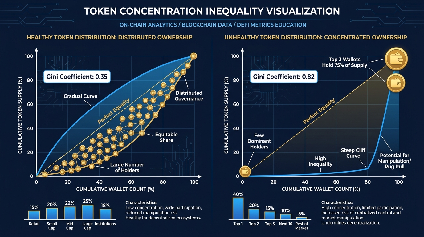
Figure 3:Distribution Comparison. Left: a token with healthy distribution — gradual curve, no single dominant holder. Right: a concentrated token — steep cliff, top 3 wallets commanding the majority of supply. The Gini problem is structural, not cosmetic.
Why does this matter structurally? Because concentrated ownership creates misaligned incentives at scale.
Consider: you launch a community token for your platform. Your top 10 wallets hold 75% of supply. You build utility features, grow users, run marketing campaigns. The price rises. At some point, one of those top-10 wallets — perhaps an early investor or team member — decides to take profits. They sell 10% of their holding, which is 7.5% of total supply, into a market with modest liquidity.
Price drops 40%. Retail holders panic-sell. Price drops another 30%. You issue reassurances. The damage is done. Your community token has lost 58% of its value in a week with no fundamental change to your product.
This is not a failure of community building or marketing. It is a failure of distribution, and it was visible in the holder concentration data before the first sale ever happened.
1.2.1Diagnosing Your Distribution
To diagnose your distribution, pull the top-50 holder list from Solscan and categorize each address:
Protocol addresses (liquidity pools, staking contracts, DEX vaults) — these are not “real” holders in the economic sense; their tokens are locked in protocol mechanics
Team and founder wallets — typically large, long-term, with low transaction history
Investor wallets — similar to team wallets but may have cliff schedules
Exchange wallets — holding tokens on behalf of retail users
Active retail wallets — frequent small transactions, diverse interaction history
After categorizing, recalculate concentration excluding protocol addresses (they inflate apparent concentration without representing sell pressure). This “adjusted concentration” is your real risk metric.
1.3Whale Watching and What Large Movements Signal
In crypto markets, “whale” refers to a wallet holding enough tokens to meaningfully move the market when it trades. The threshold varies by token — for a small-cap project, a wallet holding 1% of supply might be a whale; for a large-cap project, 0.1% might qualify.
Watching whale activity is not paranoia. It is the closest equivalent to monitoring your largest institutional shareholders. When a mutual fund that holds 5% of a public company starts selling, sophisticated investors notice. When your top-5 token wallets start moving, you should be the first to notice — and to understand what it means.
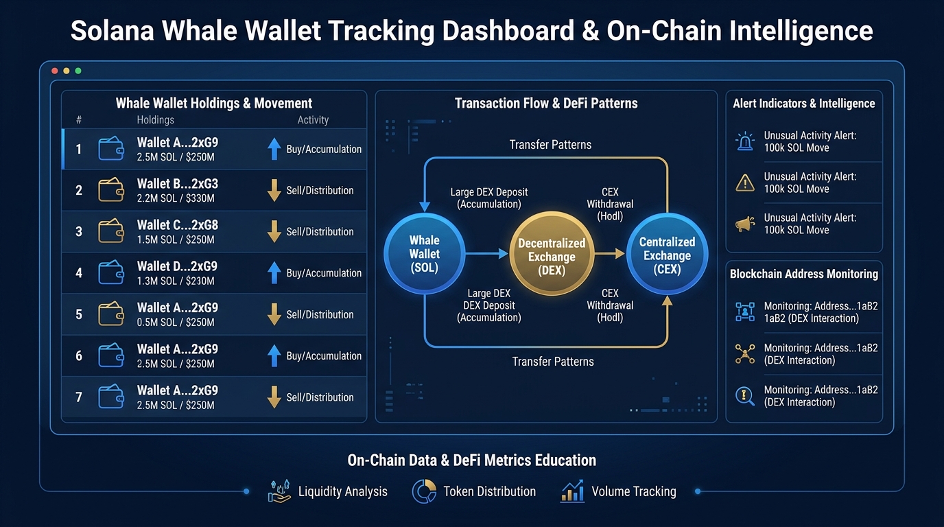
Figure 4:Whale Activity Dashboard. Large wallet movements are readable on-chain before their price impact hits. Setting up monitoring for your top-10 holders gives you 5-15 minutes of advance signal on significant market events.
1.3.1Signals and What They Mean
Whale accumulation — a large wallet increasing its position, especially outside of exchange hours or during price dips — typically signals confidence. The wallet holder is betting on future appreciation. This is generally bullish, but watch whether the wallet is known to flip quickly or has historically held long-term.
Whale distribution — a large wallet gradually reducing its position across multiple small transactions — is the most dangerous pattern. Experienced market participants distribute into strength (sell while price is rising, so each sale has less impact). If your top-10 holders are making steady small sales while price is at or near all-time highs, they may be executing an exit strategy. The distribution is visible on-chain. The retail investors receiving those tokens often do not notice until price begins declining.
Wallet-to-wallet transfers without exchange involvement — a large wallet sending tokens directly to another wallet (not a DEX or exchange) may indicate OTC (over-the-counter) trading, team member transfers, or early investor redistribution. These moves do not immediately affect price but change who holds the concentration risk.
Exchange inflow — a large wallet sending tokens to a centralized exchange hot wallet — is a near-term sell signal. Tokens move to exchanges to be sold. Not every exchange inflow results in an immediate sale (sometimes holders are rebalancing), but sustained inflow from multiple large wallets simultaneously is a reliable predictor of sell pressure.
1.3.2Setting Up Whale Alerts
Birdeye and Solscan both allow you to monitor specific wallet addresses. For your token:
Export the top-20 holder addresses from Solscan
Create monitoring alerts for any transaction above a threshold (e.g., 1% of supply in a single transaction)
Check these alerts daily — not to panic, but to maintain situational awareness
The goal is not to react to every whale movement but to understand the behavioral patterns of your largest holders so that significant changes register as signals, not surprises.
1.4Volume vs. Wash Trading: Telling Real Activity from Theater
Here is an uncomfortable truth that most token analytics dashboards are not designed to surface: a significant portion of volume in low-to-mid-cap token markets is manufactured. It is wash trading — the practice of trading with yourself (or with coordinated partners) to create the appearance of activity.
Why do people wash trade? Because high volume attracts attention. Volume-ranked lists on DexScreener and CoinMarketCap drive organic discovery. Exchanges use volume thresholds for listing consideration. Investors often filter by volume before researching a project. Manufactured volume creates manufactured attention, which sometimes converts to real interest.
The problem for you as a token creator is not just that wash trading is manipulative — it is that it gives you false data. If your dashboards show $500,000 in daily volume and $400,000 of that is wash-traded, you are building strategy on phantom demand.
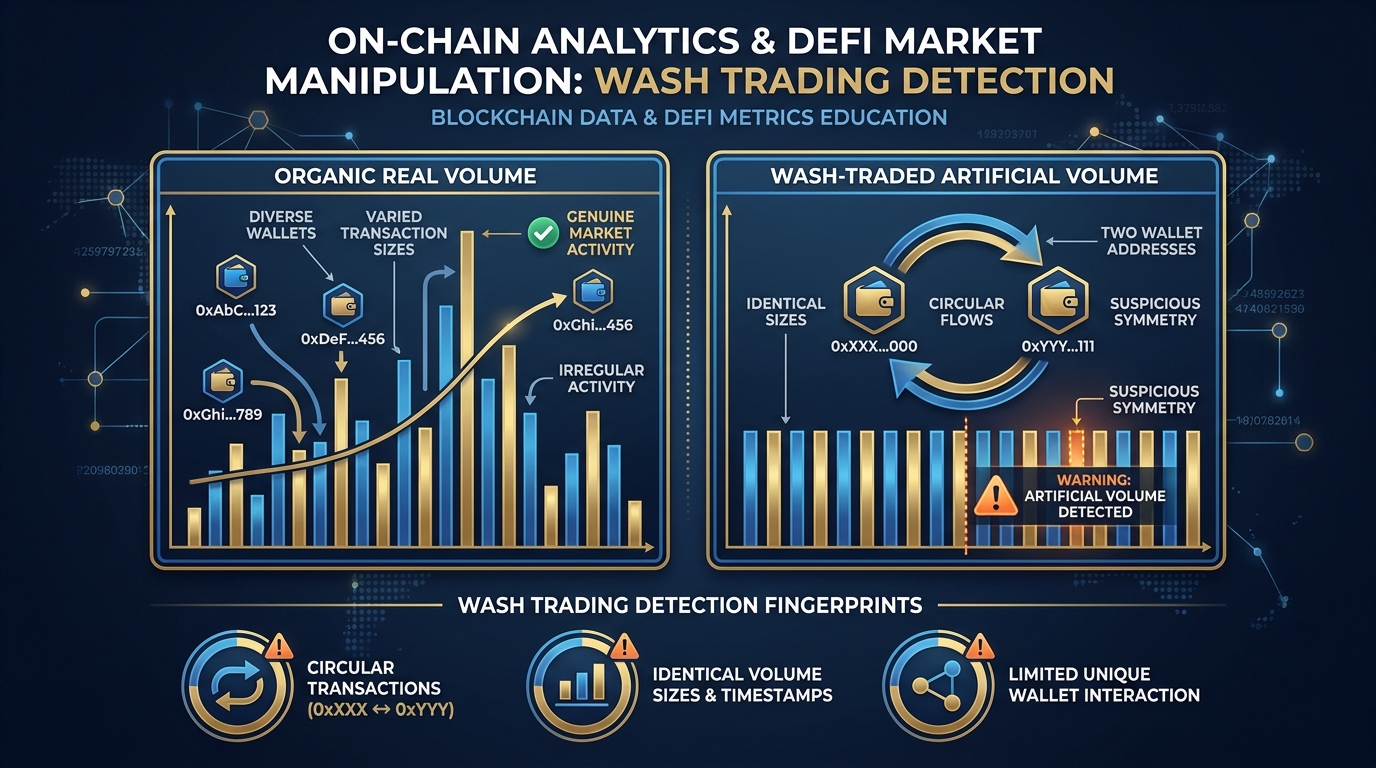
Figure 5:Organic vs. Manufactured Volume. Real trading activity shows irregular patterns, diverse wallet sources, and varied transaction sizes. Wash trading reveals itself through symmetric buy-sell pairs, repetitive transaction amounts, and a small cluster of wallet addresses generating disproportionate volume.
1.4.1Detecting Wash Trading in Your Own Token
Wallet diversity check: Pull your last 500 transactions from Solscan. How many unique wallet addresses appear? If 20% of transactions come from 3 wallet addresses, you have concentrated activity that warrants closer examination. Real organic volume comes from many diverse wallets.
Buy-sell symmetry check: Wash trading requires buying and selling the same asset. Look for wallet pairs that consistently appear on both sides of trades within short time windows. Address A buys 10,000 tokens; Address B sells 10,000 tokens; Address A and B are linked (funded from the same source wallet, for example). This pattern is the fingerprint of wash trading.
Transaction size patterns: Organic trading shows enormous variety in transaction size — some retail buys of $50, some larger buys of $2,000, some whale buys of $50,000. Wash-traded volume often shows suspicious regularity: many transactions of nearly identical sizes, executed at mechanical intervals.
Price impact vs. volume ratio: Genuine high volume moves price — it reflects real supply and demand pressure. Wash-traded volume specifically avoids moving price (the same entity is buying and selling; net position unchanged). If you see high volume with unusually flat price action over extended periods, the volume may not be what it appears.
1.5The Analytics Stack: Solscan, Birdeye, and DexScreener
These three tools together form the open-source intelligence stack for any Solana token economy. They are free, they are real-time, and they give you more information about your token’s market dynamics than most public companies receive about their stock in a month.
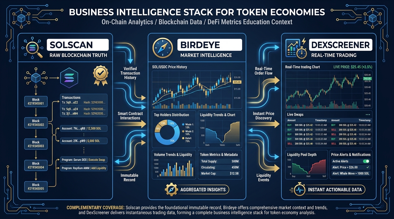
Figure 6:The Analytics Stack. Each tool in your intelligence stack has a primary function. Solscan is your transaction ledger — the raw truth. Birdeye is your market intelligence layer — the aggregated picture. DexScreener is your trading dashboard — the real-time pulse.
1.5.1Solscan — The Source of Truth
Solscan is the Solana block explorer. It reads raw blockchain data and presents it in human-readable form. For any Solana token, Solscan provides:
Token overview: Total supply, circulating supply, mint authority status, freeze authority status
Holder list: Every wallet holding your token, ranked by balance, with percentage of supply
Transaction history: Every mint, transfer, burn, and swap involving your token
Market data: Price, market cap, 24h volume aggregated from on-chain DEX activity
How to use it for BI: Bookmark your token’s Solscan page. Check it daily. Focus on the Holders tab trend (growing? stable? shrinking?) and the Transactions tab for unusual activity patterns. Solscan is your source of truth — if something looks wrong elsewhere, verify it here.
Advanced use: Solscan’s account detail pages let you investigate any specific holder. Click on a large wallet to see its full transaction history, when it received your token, what else it holds, and whether it has been involved in known scam or rug operations (Solscan flags some addresses).
1.5.2Birdeye — The Market Intelligence Layer
Birdeye aggregates data from Solana DEXes and presents it through an analyst’s lens. It is particularly strong for:
Multi-timeframe price charts: 1-minute through weekly candles
Liquidity tracking: Total liquidity across all pools, broken down by pool
Holder analytics: Historical holder count trends, new holder acquisition rate
Trader analysis: Top traders by volume, buy vs. sell pressure over time
Social-linked data: Wallet social profiles when available
How to use it for BI: Use Birdeye’s “Traders” tab to identify your most active community members (by on-chain activity). These are potential ambassadors, governance participants, and power users. The liquidity trend chart is essential — if liquidity is declining week-over-week while you are actively building, that is a warning sign that market makers are losing confidence.
Key metric to watch on Birdeye: The buy-to-sell ratio. When buys consistently outpace sells (even modestly), you have net positive sentiment. When sells consistently outpace buys, sentiment is shifting before price necessarily reflects it — this gives you early warning.
1.5.3DexScreener — The Trading Dashboard
DexScreener is where traders and speculators discover tokens. It is the Bloomberg Terminal of decentralized exchange activity, showing real-time trading data for every DEX pair across all major chains.
For your token, DexScreener shows:
Pool-by-pool trading activity: Volume, price impact, liquidity per pool
Transaction feed: Every individual trade in real time
Price chart overlaid with volume bars: The standard view for technical traders
5-minute through daily timeframes: Multi-scale price behavior
How to use it for BI: DexScreener is your best tool for discovering anomalies in real time. Unusual volume spikes, unusually large individual transactions, and sudden liquidity additions or removals all show up here immediately. Set DexScreener as your “open browser tab” during active periods in your token’s lifecycle.
The discovery angle: DexScreener ranks tokens by volume. A token that organically reaches top-20 in its category on DexScreener gains significant exposure to traders actively seeking new opportunities. Understanding this discovery mechanic helps you time your utility launches, partnerships, or community events to align with volume spikes that could drive organic discovery.
1.5.4Dune — The Query Layer
Dune indexes Solana and lets anyone write SQL over transactions or fork public dashboards. Where Solscan, Birdeye, and DexScreener answer the questions their designers anticipated, Dune answers the questions you write yourself — or, more practically, the questions someone else already wrote and published as a public dashboard. For this course, read rather than write: search Dune for public Solana dashboards covering daily active wallets, DEX volume, or protocol-level activity, and fork or bookmark the ones relevant to your category.
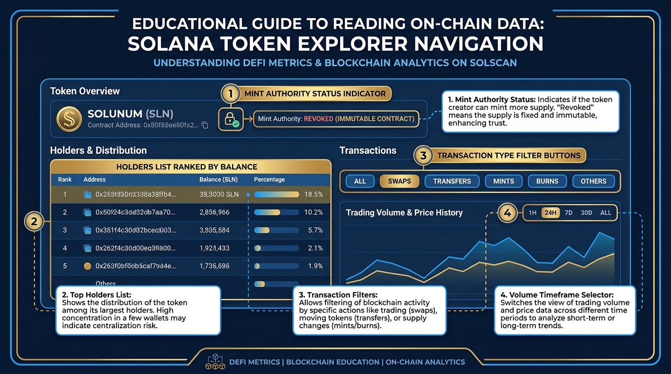
Figure 7:Solscan Deep Dive. A walkthrough of the key data points on a Solana token’s Solscan page. Numbers highlighted: (1) mint authority — if not revoked, new tokens can be created; (2) holder rank sorted by balance; (3) transaction type filter; (4) volume by timeframe.
1.6The Analytics Feedback Loop
Metrics do not exist in isolation. They interact with each other, and — more importantly — they respond to the decisions you make as a token creator. Understanding this feedback loop is what separates a token creator who reacts to data from one who manages with it.
The loop works like this:
Metrics → Decisions → Distribution → Metrics
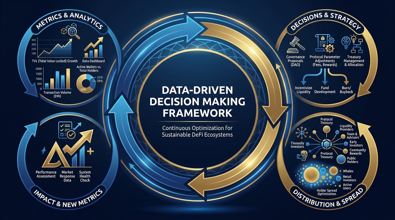
Figure 8:The Analytics Feedback Loop. Metrics inform decisions, decisions alter distribution, altered distribution generates new metrics. A token creator who understands this loop manages proactively rather than reactively.
Consider a concrete example:
Metrics reveal: Top-10 holder concentration at 68%. Holder count stagnant for three weeks. Transaction count low but stable.
Decisions made in response: Launch a community rewards program that requires holding tokens to earn utility access. Partner with three content creators to run educational campaigns that drive new holder acquisition. Allocate 5% of treasury to ecosystem grants that distribute tokens to builders.
Distribution changes: Top-10 concentration drops to 55% over 60 days as new holders enter and grant recipients activate. Holder count grows 35%. Transaction count increases as rewards program drives utility engagement.
New metrics: Lower concentration → lower structural risk. Growing holder count → expanding economic base. Higher transaction count → living economy rather than static holding.
Next decision cycle: With a healthier base, you can raise the liquidity target, consider governance activation (safe now that distribution is more even), and plan a community vote on tokenomics adjustments.
The feedback loop never stops. Your analytics practice is not a one-time audit — it is a perpetual management cadence.
1.7Building Your Token Dashboard
The analytics tools above are powerful individually. Combined into a single dashboard, they become a management instrument that no traditional business has access to — real-time, granular, zero-cost visibility into the entire state of your economic system.
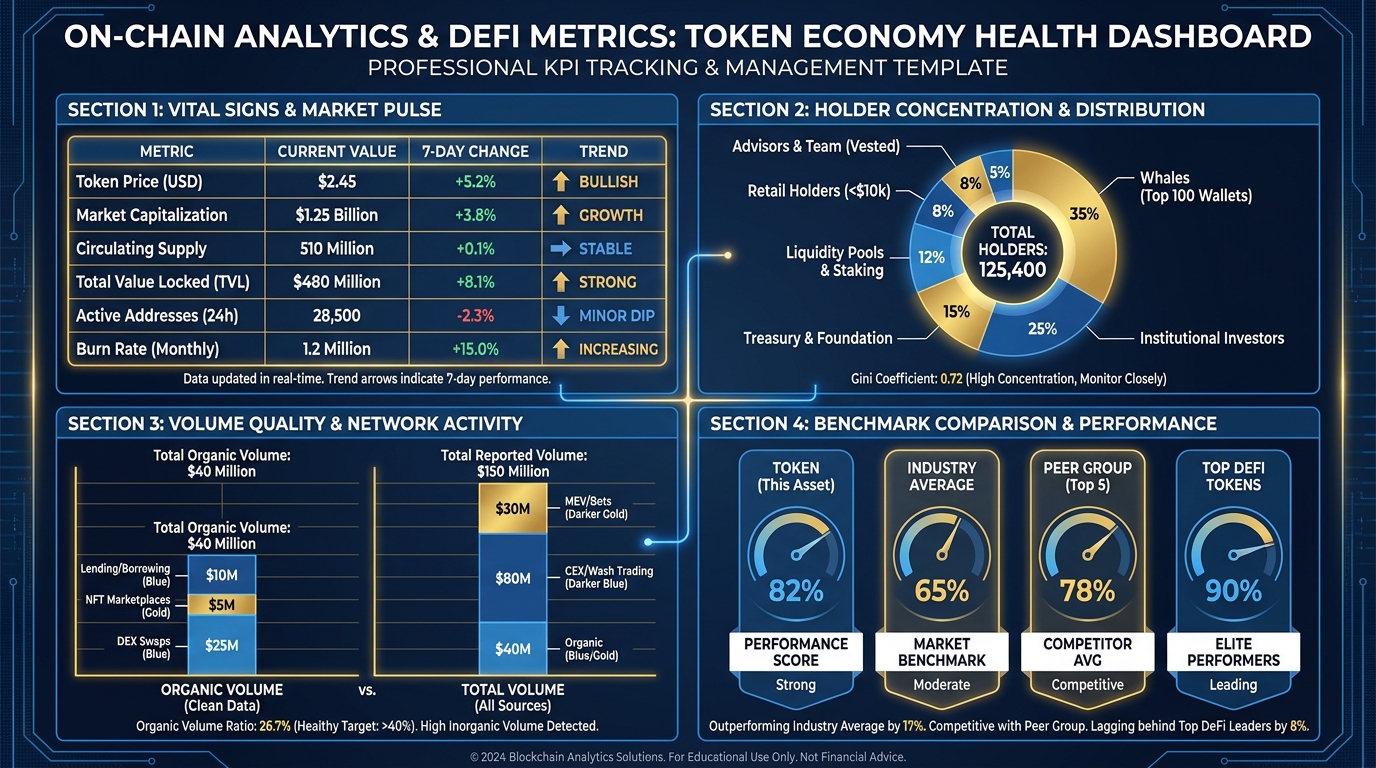
Figure 9:The One-Page Token Dashboard. A practical template for tracking all vital signs in a single view. Built in Google Sheets or Notion, updated weekly, this dashboard gives you the management visibility that traditional businesses pay consultants to approximate.
1.7.1What Goes in Your Dashboard
Your dashboard should capture, at minimum:
Section 1 — Vital Signs (updated weekly)
| Metric | Current | Prior Week | 4-Week Trend |
|---|---|---|---|
| Holder count | — | — | ↑ / ↓ / → |
| 24h average volume | — | — | ↑ / ↓ / → |
| Liquidity depth (total) | — | — | ↑ / ↓ / → |
| Top-10 concentration | — | — | ↑ / ↓ / → |
| 7-day transaction count | — | — | ↑ / ↓ / → |
Section 2 — Concentration Analysis (updated monthly)
List your top-10 holders, their balance, percentage of supply, wallet category (team/investor/retail/protocol), and last significant transaction date. Flag any holder showing distribution behavior.
Section 3 — Volume Quality
Organic volume estimate (total volume minus suspected wash-trade volume). Buy-to-sell pressure ratio from Birdeye. Number of unique trading wallets in past 7 days.
Section 4 — Benchmark Comparison
Pick one published token in your category that you respect. Pull their equivalent metrics. Side-by-side comparison anchors your metrics to a reference point and prevents the trap of celebrating mediocre numbers in isolation.
1.8Comparative Analysis: Benchmarking Against the Field
Every metric gains meaning from context. A holder count of 3,000 is excellent for a token three weeks old with no marketing budget, and concerning for a token two years old with a significant community investment. The absolute number tells you less than the number relative to comparable projects.
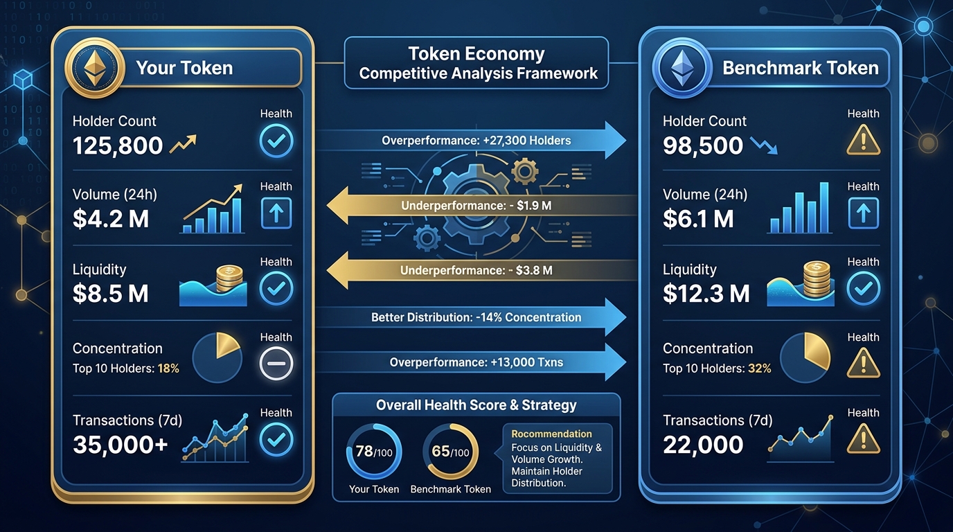
Figure 10:Benchmarking in Practice. Your token’s metrics gain meaning only when placed next to comparable projects. This comparison framework reveals where you are overperforming, where you are lagging, and where you should concentrate management attention.
When choosing a benchmark token, apply these criteria:
Similar age — a six-month-old token benchmarked against a three-year-old token will always look underdeveloped. Compare apples to apples.
Similar category — community tokens have different healthy metrics than DeFi protocol tokens, which differ from NFT utility tokens. Category matters.
No artificial inflation — avoid benchmarking against tokens known to use wash trading or bot-driven volume. Your reference point should represent genuine health.
Accessible data — the token should be on Solscan and Birdeye with sufficient history to pull meaningful comparisons.
Once you have your benchmark, run the same five-metric analysis and write a one-paragraph diagnosis. The discipline of writing the diagnosis — not just recording the numbers — is what converts data into insight.
1.9Read a Token in 60 Seconds: The Buyer’s Check
Everything in this chapter consolidates into a single habit: before you buy, hold, or list any token, run this checklist. Each item names where to look.
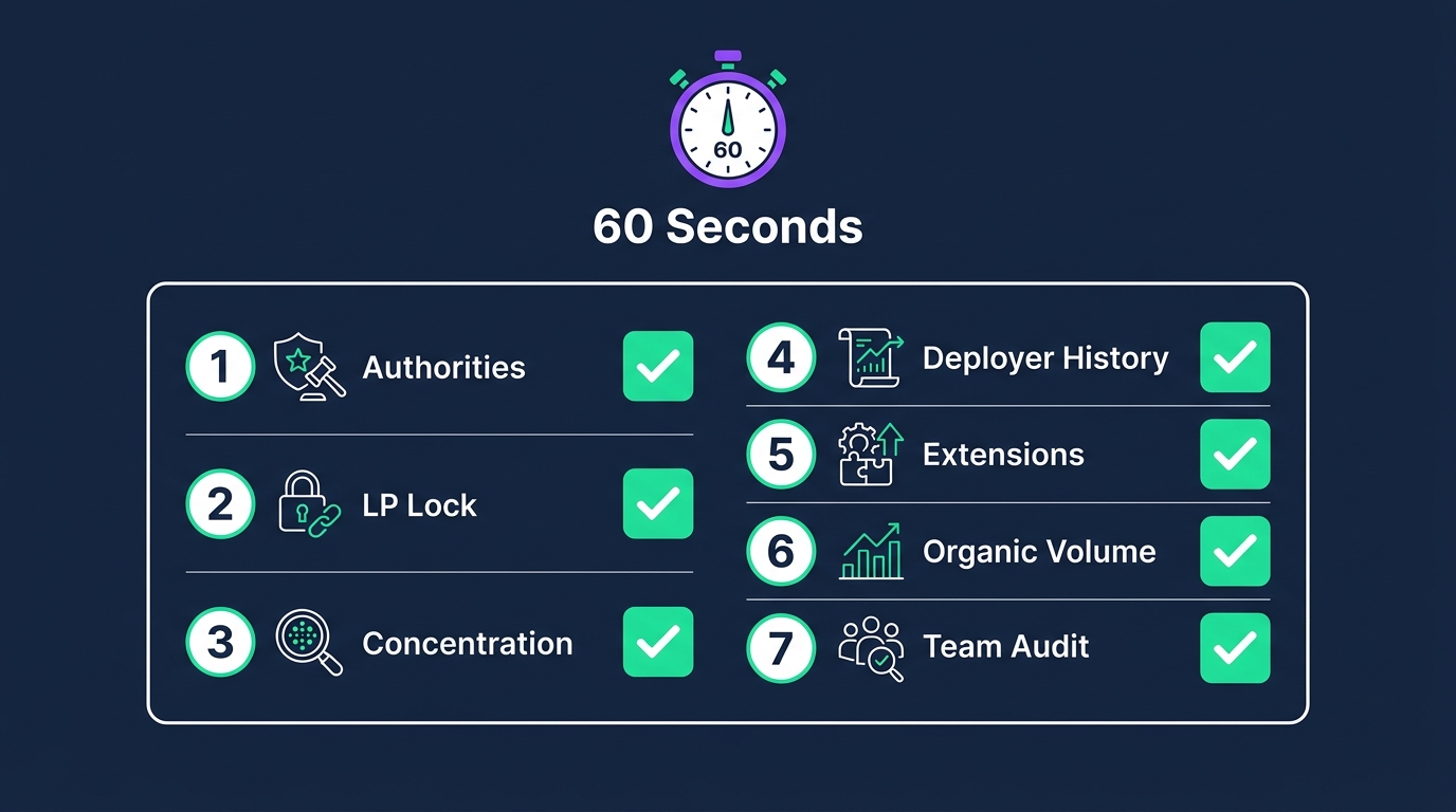
Figure 11:The 60-Second Buyer’s Check. Seven checks, seven places to look, one minute of work — the minimum diligence before touching any token.
Mint authority and freeze authority revoked? — Solscan token page (Chapter 3).
LP locked or burned, and how much? — RugCheck / DexScreener (Chapter 5).
Top-10 concentration, excluding pool addresses — Solscan holders (this chapter).
Deployer wallet history — click the creator address on Solscan; has it deployed other tokens, and what happened to them?
Token-2022 extensions that concentrate power (permanent delegate, freeze) — Solscan extensions panel (Chapter 3).
Is the volume organic? — this chapter’s wash-trade test.
Is there a published team, allocation, and audit? — Chapter 12.
The whole check takes one minute and would have caught most rug pulls in the last three years.
1.10📊 Hands-On Lab: Building Your Token Dashboard
This lab takes you from raw blockchain data to a live, management-ready one-page dashboard.
1.10.1Lab Objectives
By the end of this lab, you will have:
Pulled all five vital signs for your token from Solscan, Birdeye, and DexScreener
Built a structured one-page dashboard capturing current state and 4-week trends
Conducted a top-10 holder concentration analysis with wallet categorization
Selected a benchmark token and run parallel analysis
Written a one-paragraph health assessment diagnosis
1.10.2Step 1: Gather Your Token’s Vital Signs
Open Solscan and navigate to your token’s page. Record:
Current holder count (Holders tab)
Top-10 holder addresses and their percentage of supply (Holders tab, sorted by balance)
7-day transaction count (Transactions tab, filter to 7 days)
Open DexScreener and search for your token’s trading pair:
24-hour volume (shown on the pair page)
7-day volume (switch to 7D view)
Current liquidity depth (shown as “Liquidity” on the pair page)
Open Birdeye and navigate to your token:
Buy-to-sell pressure ratio (Traders tab)
Liquidity trend chart — note direction over past 30 days
Record all values in your dashboard template.
1.10.3Step 1a: Read a Dune Dashboard (5 min)
Open https://dune.com, search “Solana” dashboards, open any public dashboard showing daily active wallets or DEX volume, and record one number and its date. Note that you did not need an account or code.
1.10.4Step 1b: Read the DeFi Map (5 min)
Open https://defillama.com/chain/Solana. Record total TVL and the top three protocols by TVL, and label each as DEX, lending, or liquid staking (all defined in Chapter 5, Beyond the Pool). Compare to the numbers you recorded in Chapter 5’s Part E.
1.10.5Step 2: Categorize Your Top-10 Holders
For each of your top-10 holder addresses, click through to their Solscan account page and note:
Approximate wallet age (when was it first funded?)
Transaction frequency (how many transactions in the past 30 days?)
Wallet category (protocol contract? team? early investor? active trader? dormant?)
Recent activity related to your token (buying, holding, distributing?)
Calculate the concentration percentage for protocol addresses vs. non-protocol addresses separately. Your adjusted concentration (excluding protocols) is the metric that matters for structural risk assessment.
1.10.6Step 2a: Run the Buyer’s Check (10 min)
Run the 60-second Buyer’s Check on your own token and on your benchmark token; put both in a two-column table. Optional: open https://app.bubblemaps.io, load your benchmark token, and screenshot the holder cluster map — connected bubbles are wallets funded from the same source (the Sybil and wash-trade fingerprint).
1.10.7Step 3: Select and Analyze Your Benchmark Token
Choose a token in the same category as yours that has been operating for a similar length of time. Apply the same five-metric analysis. Record the results in a parallel column in your dashboard.
1.10.8Step 4: Write Your Health Assessment
Using your data and the benchmark comparison, write a single paragraph — approximately 150-200 words — that:
States your current health status across the five vital signs
Identifies your strongest dimension (where you compare favorably to the benchmark)
Identifies your highest-risk dimension (where you lag most significantly)
Proposes one specific, data-driven action you would take in the next 30 days to address the risk
This paragraph is your token economy’s health assessment. It is the deliverable that matters — not the spreadsheet.
1.11🎯 In-Class Assignment: Analytics Dashboard Presentation (10 pts)
Details and instructions will be provided in class.
Points: 10
1.12💬 Discussion: Radical Transparency and the Glass Airplane
Public companies report quarterly. They hire teams of people to control what those reports reveal and how the numbers are framed. A CEO can make a disastrous strategic decision in January, hide its consequences through accounting choices and narrative management, and not face market consequences until the Q4 earnings call eleven months later. Competitors see only the curated version. Customers see only the marketing version.
Token economies work differently. A token creator who makes a poor treasury management decision on Monday will see its consequences in liquidity depth by Wednesday and in holder count by Friday. Competitors, holders, critics, and observers see every transaction in real time, on the same data they have access to, with no narrative layer in between.
This chapter’s core question: Is radical transparency good for a business?
▶ Watch: Zero Knowledge Proof — ZKP (10 min)
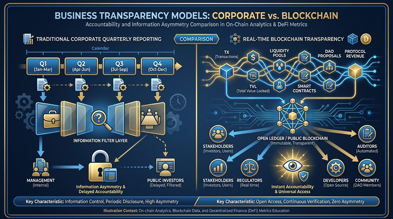
Figure 12:Transparency Models Compared. Traditional quarterly reporting gives companies an information asymmetry buffer. On-chain transparency eliminates it. The question is not which model is more honest — both can be honest — but which model produces better decisions and better accountability.
Consider what changes when every transaction is public:
For the token creator: You cannot hide bad decisions long enough to fix them quietly. This creates pressure toward better governance, more conservative treasury management, and more transparent communication — because the alternative (hoping no one notices) is structurally impossible. This is discipline imposed by the architecture.
For holders: Information asymmetry — the advantage that insiders always hold over retail investors in traditional markets — is dramatically reduced. A sophisticated holder who knows how to read on-chain data has access to the same raw information as the founding team. This levels a playing field that has historically been brutally uneven.
For competitors: Your liquidity strategy, your largest holders, your volume trends, your community growth — all visible. There is no competitive moat built from information secrecy. Every playbook is readable.
For the market: Radical transparency might produce more efficient price discovery — prices that reflect real utility and community health rather than managed narratives. It might also produce higher volatility, as every imperfect decision by every team member immediately propagates into market data.
The glass airplane flies just as well as an opaque one — arguably better, because every structural problem is visible before it becomes fatal. But everyone on board and on the ground can see everything. That is a different kind of flight.
1.12.1Discussion Guidelines
For your initial discussion post, address this question: If you were the CEO of a major company, would you voluntarily adopt on-chain-style radical transparency — making every significant financial transaction publicly visible in real time? Under what conditions would this help you, and under what conditions would it hurt you?
Requirements for your post:
Take a clear position (yes/no/conditional) and defend it with reasoning
Reference at least one scholarly or credible source discussing corporate transparency, information asymmetry, or market efficiency
Connect your argument to at least one specific on-chain metric you worked with in this chapter’s lab
For your peer responses:
Respond to at least two classmates with substantive analysis (more than agreement or disagreement — engage with their specific argument)
If they reach the opposite conclusion from yours, explain what in their reasoning you find strongest and where you see a flaw
If they reach the same conclusion, challenge one assumption they made or extend their argument with a dimension they did not consider
1.13Glossary
On-Chain Analytics The practice of reading and interpreting data recorded directly on a blockchain — transactions, balances, contract interactions — as a form of market and business intelligence.
Holder Count The number of unique wallet addresses currently holding a non-zero balance of a specific token. A measure of an economy’s user base breadth.
Liquidity Depth The total value of assets in a liquidity pool or market maker order book, determining how much buying or selling pressure the market can absorb before the price moves significantly.
Top-10 Concentration The percentage of total token supply held by the ten largest wallets. A key structural risk indicator — higher concentration means greater vulnerability to coordinated selling.
Gini Coefficient A statistical measure of inequality in distribution, ranging from 0 (perfect equality) to 1 (perfect inequality). Applied to token economies, it captures how evenly supply is distributed across holders.
Whale A wallet holding a large enough position to materially move the token’s price when trading. The threshold is relative to each token’s total market cap and liquidity.
Wash Trading The practice of simultaneously buying and selling the same asset (or coordinating trades between controlled wallets) to create artificial volume without genuine economic purpose.
Organic Volume Trading volume generated by independent buyers and sellers acting from genuine economic interest — as distinguished from wash-traded or bot-generated volume.
Solscan The primary Solana blockchain explorer. Provides raw transaction data, holder analysis, token statistics, and account investigation tools.
Birdeye A Solana-focused market intelligence platform aggregating DEX data to provide holder trends, liquidity analysis, trader behavior, and buy/sell pressure metrics.
DexScreener A multi-chain DEX trading dashboard that provides real-time price charts, volume data, and transaction feeds for decentralized exchange pairs.
Buy-to-Sell Ratio The ratio of buy-side trading volume to sell-side trading volume over a given period. A ratio above 1 indicates net buying pressure; below 1 indicates net selling pressure.
Exchange Inflow The movement of tokens from private wallets to centralized exchange addresses, typically a near-term sell signal.
Distribution In token economics, the process of reducing concentration by moving tokens from early/large holders to a broader, more diverse holder base.
Analytics Feedback Loop The cyclical management process in which metrics reveal conditions, those conditions inform decisions, decisions alter distribution and behavior, and the altered state produces new metrics.
OTC Trading Over-the-counter trading — direct peer-to-peer transactions occurring outside of exchange order books, typically between large parties at negotiated prices.
1.14Leader’s Takeaway
The most powerful insight this chapter delivers is not technical — it is philosophical. You have just learned that the economy you are building is the first kind of economy in history that cannot lie about itself. Not because the people involved are more ethical, but because the infrastructure makes concealment structurally impossible.
This is a profound responsibility and a profound advantage.
The responsibility: your mistakes are public. Your concentrations are public. Your liquidity decisions are public. The quality of your distribution strategy is visible to everyone who looks. There is no “manage the narrative” in a world where the data is the narrative.
The advantage: your successes are equally public. Organic growth, genuine holder acquisition, improving concentration, deepening liquidity — these metrics are visible to exactly the same people who would see your failures. In a world where most projects obscure their numbers, a project that publishes its dashboard voluntarily and shows consistent improvement stands out immediately.
A token creator who monitors their economy’s vital signs weekly, maintains a benchmarked dashboard, and reads their holder distribution honestly is not performing sophistication. They are practicing the minimum viable diligence that your holders deserve and your economy requires.
Fly the glass airplane. Just make sure it is actually airworthy.